Showing posts with label Woodcut. Show all posts

Friday, 5 December 2025

A second commissioned piece


 A bit of a long story, this one, A local councillor found out that he has a rare cancer without a good prognosis, so he decided he wished to give an award at the Rugby Open each year to work that showed care for the environment. He wanted a hand-made trophy that could be given each year to the winner. We steered him towards local woodcarver Tom Jennings, who designed and carved a trophy out of ash.

The trophy was awarded at the start of the Open, last Friday. The councillor felt that there should be something each winner could keep, unlike the trophy which is returned each year. So last weekend he asked me to make a print based on Tom's original drawing. Hence this. I felt a woodcut would be most appropriate, especially as I had a piece of shina ply to hand.

It must be a good five years since I last did a commission. That kind of space between commissions is probably about right. 

Wednesday, 5 February 2025

Black Sun, Cemex


 This print has been a long time coming. I've been stuggling with it for months. It ended up that there was one corner that I liked. So I decided to cut the rest away and go with a print half the size. Anyway now it can be the third Cemex print, and I'm happy to chatge money for it. It was going to be much more complicated with multiple blocks, which is why the sun is the "wrong" colour. But when I decided the Sun was black, everything fell into place. Do you remember staring at the sun when you were a kid? Even when you were told not to. The world turned colour then, didn't it?

Sunday, 21 January 2024

Rugby Artists and Makers: Go Fourth! Exhibition


 In the same slot as last year at Floor One Gallery in Rugby Art Gallery and Museum - the last couple of weeks of the Rugby Open in the big Gallery Upstairs. (23 January - 3 February)

My work for this exhibition is Poppies. Its a work that has grown on me over time. I like it much more than when I first did it. So I feel it should show its face around the place so that others get to appreciate it too.

PS. 22/01/24 - exhibition hung today, probably the best looking RA&M exhibition to date, Link to the catalogue here.

Tuesday, 3 October 2023

Northern approach


 As I drive into Rugby from the M6 I catch a glimpse of a cooling tower and some kind of low industrial building lurking among the trees. It's only visible for a few seconds and it's easy to miss, cuz you're driving and paying attention to other things. Then it disappears and it's nowhere obvious when you get to town. I know where it is now, but you do have to search for it. You can find it in other vistas, among terraced Victorian streets.

I suppose I could have parked up somewhere and found a good vantage point and done a proper drawing. But I prefer this brief snapshot, this Augenblick I get when driving along. It's more my fantasy of the place, really. Both the brutalist buildings and the seeming woodland are not what you get when you reach the town. I love that it's both true and a kind of lie at the same time.

Wednesday, 13 September 2023

Poppies


 We had some huge poppies come up this year. They were nearly as tall as me. I did some crayon drawings back then and moved on. I went back to the drawings and used them as the basis of this woodcut. Just to carry on the theme of flowers.

I'd bought some shina ply a couple of years back to try out and it's taken me until now to give it a go. For sure it's easier to cut than "shed" plywood, but it has a "softer" effect - so I'm not sure if it works out that much different than lino. But still, worth a go.

I printed on some "vintage" paper that a watercolourist had primed. I don't know if the priming was originally pinkish or whether it had aged like that. Anyways, I liked the subtle effect of the brushwork. Interestingly it took a long time for the ink to dry as it had no way to evaporate into the paper...

Friday, 21 July 2023

Steve Davies: Made at the Alex 21 - 30 July


I've taken over the walls at the Alex for an exhibition until we close for August. 

All the works on display here were made after we moved to the Alex in February 2022. More than that, nearly all of them were made when we were open to the public. When the doors are closed, there is plenty of other work to be done, running and maintaining the place. So it’s something of a surprise to me that I’ve got so much done. Partly because of this limited time window, I tend to work at speed. Make decisions quickly. Let my body take over. Sure, mistakes occur. But the point is to work with them. In the moment. 

Printmaking is a graphic art. As such its roots are in drawing. It comes out of organising and selecting from the world. A way of honing things down, of cutting away what is not essential. A way of dealing with too much information. Printmaking is also a way of sneaking up on your subject matter. The process of cutting – taking away the “non-drawn” parts and working in the mirror image of the final print – creates a distance between the artist and the work. So there is always something in the end that surprises me.


Saturday, 20 May 2023

Unser täglich Brot


 Gieb uns heute.

An old bread board. Instead of throwing it out, or burning it, I decided to make a woodcut. I went for Uncle Death again, because he looks like he could use a sandwich...

I was channeling a lot of artists here. Tal R with the breadboard, though mine was a boring rectangular one. But also Naoko Matsubara and Shiko Munakata, because I decided to cut directly into the block without any preparatory drawing - and let it just take the shape it wanted to.

It's not a great piece, but it's somehow better than it deserves, having taken shape during what I guess Tal R means by "free falling". I tried different papers, too. First the card I normally use, then some Shoji paper which better shows the grain and the cuts and gouges in the board surface.

Saturday, 17 September 2022

Figs


I felt it was my last chance to do some figs this year, with Autumn coming and all. I picked some ripeish ones and did some drawings before I ate them. Erich Heckel did a lithograph of 3 figs and a leaf in 1965, so this is me taking my hat off to him.

I decided on woodcut because it seemed a bit more “heritage” for the Heritage Open Days we’re doing at the Alex. And I like the texture. 

There's a sensuality about figs and I cut the one in half to emphasise their edibleness. And I wanted to eat some there and then. I'm pleased with how the colours work together on this one. I've been trying not to be intimidated by colour and have been letting each one assert itself as it will. I also rmember the Beano and other comics from when I was a kid and how sometimes the register would be a bit off and things would happen to the image. Not sure what, but "things". So I've been packing around the blocks on the press to achieve just the right level of offness...

Tuesday, 29 June 2021

Green Fig


Not a usual look for me. It’s something I’ve been working on as part of another piece. But then I thought given its size and shape, it might work as a stand-alone image on a card.

I’ve also got some blank brown/grey cards that I hadn’t thought of a use for. So this seemed an ideal opportunity to try them out, too. 

This one's a wood cut print. For no better reason than I wanted to have a go with the decent hangi-to I bought a little while back. The darker green ink is stuff left over from the still life with a tank, applied with a bit of sponge on top of the brighter green. 

Have to work on the rest of the bigger picture now.

Thursday, 15 April 2021

Ghostly Maenir


I felt that the original Maenir print didn’t achieve quite the vibe I wanted, but I thought recently there was maybe a smaller print in there, trying to get out. So I’ve brought her back for an experiment, printed against a roughly-cut and gnarled-up block, around 10”x8” in size.

I like the background block. There’s something that says pine forest to me, or some kind of mountain landscape maybe. Or pines on a moor. (It’s just occurred to me that pine moor is “Matsubara” – my favourite Japanese woodblock artist). A good place for this standing stone.

This rendition makes her more ghostly. And some of the early impressions came out even more so. She looms out of the subtle broken-up landscape, like out of a fog. Maybe she’s more like Kate Bush’s poor, dead Cathy here, “Heathcliff, it’s me, your Cathy, I’ve come home. I’m so cold. Let me in your window.”

Sunday, 25 October 2020

Love in an Age of Pestilence: Barrier Methods


This is the first of three prints I’ve entered for Rugby Open 2020. The deadline was yesterday, so I’m posting them each here separately over the next couple of days.

The challenge has been how to talk about the world today without, on the one hand, being sentimental and mawkish, or on the other, browbeating the viewer. Or both. I hope I’m getting there with these prints.

I’ve done three images on the theme of “Love in an Age of Pestilence.” There is of course the danger that if the judges don’t like the idea, all three are out. But I really wanted to give these a go. I feel that two things will get us through this mess. Love and humour. So this is me shining my tiny light into the void. We shall see. We shall see.

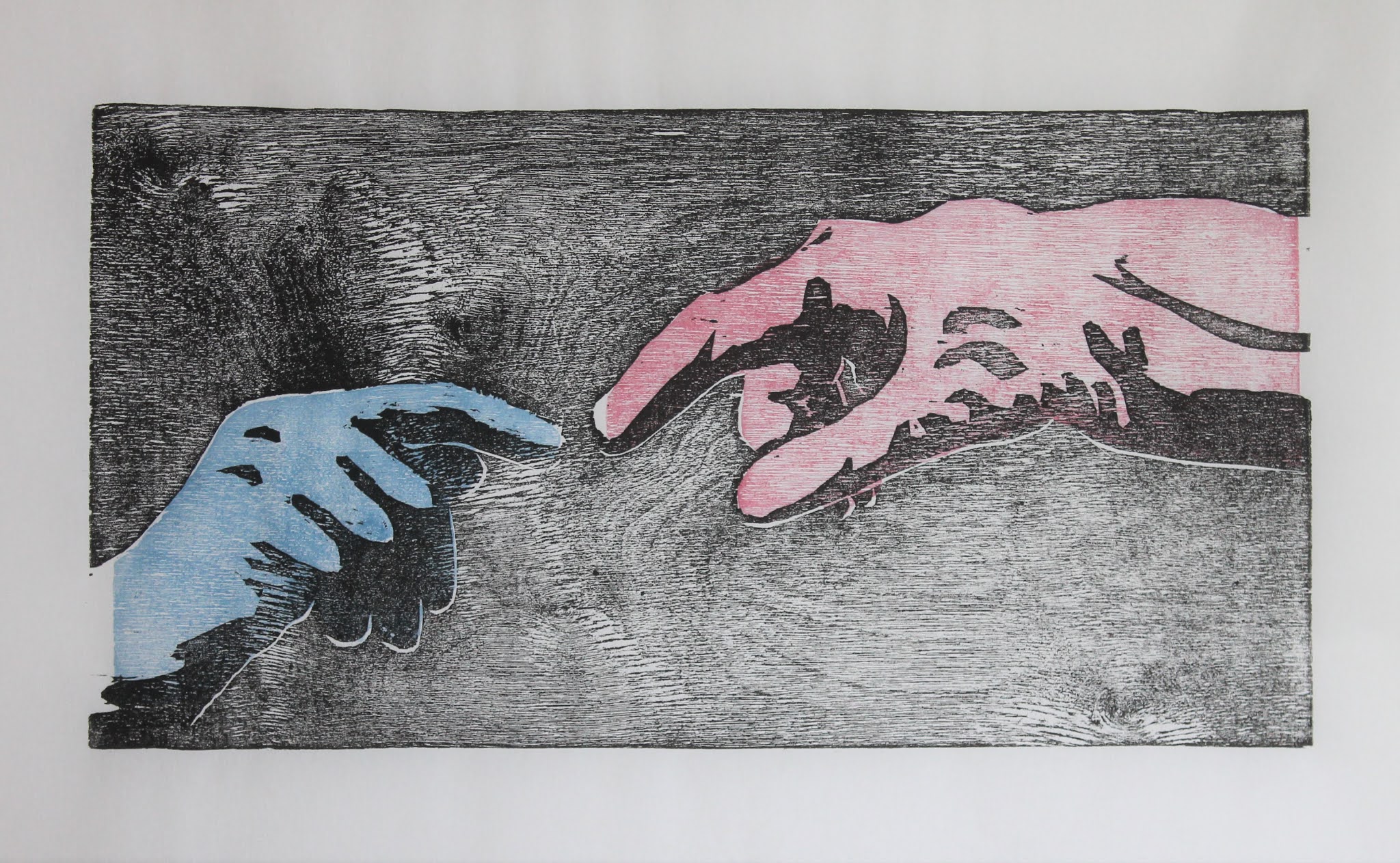
This one is subtitled, “Barrier Methods.” It’s a kind of fugue on my Meditations prints, but bigger. I didn’t look at the Sistine Chapel fresco, because I wanted it to reflect my faulty memory. And my hands. Well, both are my left hand, wearing rubber gloves from under the sink. I knew it was God’s right hand and Adam’s left, but I wanted a degree of equality between the two. So two right hands. This is not God and Adam here. It’s Everywoman and Everyman.

I plumped for woodcut here to give the swirling effect of the world of bugs we live in. And I wanted the fight of cutting the hands. Symbolic of the act of reaching out. The wood is from an old packing case that was dumped on the drive. Giving these things a second life brings me joy.

Friday, 28 August 2020

Maenir: Sounding the mists of time.

This is my entry for the Wales Contemporary/Cymru Gyfoes open exhibition. The exhibition has been delayed from earlier in the year by COVID, but is going ahead in the autumn and early next year. The theme is “Inspired by Wales”. I’d got a number of ideas in my head, but I wasn’t convinced by them. I wanted something that was the Wales I grew up in, or rather the Wales that was in my head at that time.

There’s an animism at the back of Welshness. As if the very stones are possessed of life. A Maenir (standing stone) watches over a field near where I grew up. It was one of the stations of a local history field trip when I was at primary school. I’m sure it’s not as monstrous big as my 9-year-old self remembers it. But it’s big enough.

Local legend had it that once a year at Christmas time, the stone got up and walked the couple of miles to the sea for a drink. Maybe a relic of the old animism that planted it there.

So here she is, feeling thirsty, sat among the fading attempts to overwrite her existence. No doubt she had sisters, but they’ve gone now, along with the monks and miners, the fortresses and foundries.

Welsh culture always seemed predominantly verbal. It speaks and sings its place in the world. So my Maenir’s environment is a verbal one, a ruined castle made of words. The past and present of the little world I grew up in. All past now. But the Maenir still stands.

I wanted the word “Maenir”, too. But I wanted it to be typographically different from the background text, not just a different colour. The letters I used are from the Bodvoc stone, a late Roman memorial stone that was discovered at Margam, not far from this Maenir.

I think the medium of woodcut lends itself to the subject matter. The texture, the recalcitrant material, the whole execution felt more… primitive. Though of course we know it’s not.
Saturday, 15 February 2020

Coventry Open 2020 - submissions

I felt it would be a good plan to get to the Herbert at opening time to avoid the worst of Storm Dennis. Plenty of other people had the same idea, too. So if determination is a sign of quality, we're in for a good show.

Today is also HAP Grieshaber's 111th birthday, so I'm taking that as a good omen for printmakers.

These are the pieces I put in for selection.

The first is a woodcut called Sounding – The Bells. It will be (I hope) the first in a series sounding the depths of my life. It should add up to an unreliable autobiography, as I drop a weighted line into the swirling ocean of my past, and make images based upon what I hit. Things of great importance and none. Things that affected me directly, or only tangentially.


Anyway, when I moved to Coventry in 1975 I was struck by how the city wore its damage like a badge, saying, "Remember, this is what war does.” We have so many swaggering, bellicose leaders these days, it is a message worth repeating. I think the choice of wood adds to the violence of the image. I also didn't let the ink fully dry between layers, so the colours fight with each other, too.

This second one is a linocut based on a number of drawings I made while sitting in a hospital waiting room. I'd never tried drawing people in public before, and I was struck by how preoccupied everyone was with their books, papers and devices. Trying to forget where they were.

I called it Purgatory because of the waiting to know if the news is good, or bad. And also acknowledging the inferno of the other print.

Just have to wait now to see if either gets in. My own little purgatory.

Tuesday, 26 November 2019

Rugby Open 19 (23 Nov 2019- 11 Jan 2020)

In mid-October, my wife came home from town with a card advertising for submissions to this annual art exhibition. So I decided to give it a go. My first thought was to submit Wolf in a Sheepskin – it was the standard I felt I had to aim for, anyway.

I was booked on a linocut workshop with Eric Gaskell at the beginning of November. Eric is a formidable printmaker and I attend a weekly art class he leads, so I knew I'd learn a lot. This is the print that emerged. The starting point was a few still-life drawings I had done at the other class. The skull, by the way, is a replica belonging to my son.


As I worked on the print, this Ernst Barlach/Kathe Kollwitz vibe emerged that I wasn't expecting when I started out. I was so pleased with it I thought I'd give it a name and enter it for the exhibition. (It's called “Still Life with wine Glass”.

My wife was away that weekend and I was on a roll, so I carried on over the next day or so to create another image. This one inspired by another Feline and Strange song that had been haunting me. Medusa is a song of rape survival and victim blaming. So the image is Medusa haunted by the frozen faces of those who hate her, always reminding her, even when she closes her eyes.


This one is a woodcut. It's different to lino in that it is inclined to fight back, and the act of creating the image requires more... violence. Which seems appropriate somehow.

Anyway, I decided both were better than Wolf, so I submitted both. A panel of 4 people, who change each year, decide which entrants should go into the exhibition. So I felt having 2 relatively different images increased the chance of at least one being chosen.

So I was delighted to get an email confirming that Medusa had been chosen. But when I turned up to collect the rejected print, it turned out that Still Life had been accepted and Medusa rejected. Administrative error. The plague of working life even affects art galleries. Just so you know.

Still delighted, though.