Showing posts with label Wood/linocut. Show all posts

Thursday, 15 January 2026

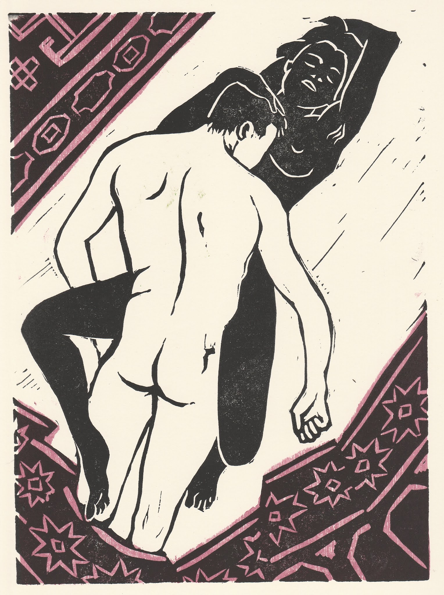
Green Room, Pink Man


 Another print that started out as one of August's life drawings. The original drawing was done quickly with brush and ink after I had worked the pose to death over the previous hour or so. It was like I had internalised the essence of the picture and could now splurge it on to the paper. I kept fairly close to the drawing for the print, except for the plant which is now far more luxuriant than the sorry specimen suffering in a school art-room. I also wanted to print it in green and blue, and jokingly call it "Green Man". But that didn't work. So pink and green. Meat and veg, as it were. The yellow stripe refers to the suboptimal lighting in the room, with the summer sun shining over the model's shoulder, and the rather poor yellow light in the room.  But it also, I think, helps to balance the picture somewhat.

I arrived at Green Room, Pink Man as a basic descriptive title (which I find often works), but I feel it also has an implication of "The Green Room" as a somewhat debauched space and that "Pink Man" is an assertion worth making in these identitarian days.

Saturday, 13 September 2025

Girl with Cat (I think)


 Haven't finally decided title yest, but simple seems best. 

This one started out as one of last month's life drawings, but I felt she needed something extra. Hence the cat. A focus for her attention. The two colour blocks are wood. As usual rubbish from the shed. It was hard and splintery, so my hands are suffering for it now. But I've needed the pain over the past few days. And the single-minded focus to help me process the tragic deatth of Charlie Kirk. The print may seem a bit anodyne, but all my grief for Charlie is in it.

Thursday, 10 July 2025

Lette Matrimoniale


 This one came together over the second half of Warwickshire Open Studios. I've been thinking about doing bed pictures since the exhibition in Mala Beds. I remembered that Lette Matrimoniale is what they say for double bed in Italy. Or at least they used to. The bed is very vaguely based on one we bought at an auction when we were newly together. 

I like the idea of her hiding behind the blanket. It could be she's being cheekily seductive, or maybe she's just woken from a scary dream. Make up your own story.

Sunday, 13 October 2024

Close Work revisited


 This last couple of weekends I worked on some woodblocks to add colour to the black-and-white version of Close Work, I used some plywood from an old wardrobe that had a rough and open grain to it. To give a nice textured effect. I'm happier with it now,

Wednesday, 13 September 2023

Sunflower


Last weekend was pretty busy and I managed to complete two prints, but didn't have time to post about them. So here they are now.

I had started cutting this one the week before, working from a drawing I did a few weeks ago when the sunflowers were just beginning to open. I like the gnarly look of sunflowers, and at this stage you get a sense of so much packed in there trying to get out. 

I was thinking about the print even as I put pencil to paper. I thought, "I'll cut like this here, like that there..." But even when you do that, the cutting takes you its own direction, and it's still a surprise.

Saturday, 10 June 2023

Skinny Woman


 The starting point for this was one of the life drawings I did back in March. It was one of the 3-minute drawings. It's a scribbly affair - working fast to get it done in the time. But I worked on simplifying it, making it more of a line drawing.

The other week I was browsing ebay (great art-historical source) and came across a few prints by Michael Hofmann (b. Chemnitz 1944). He used a technique like this, so I thought I'd give it a try. First I printed an uncut block in black, then a block cut with lines printed in white over the top. Then finally the colours.

My first attempt didn't work out very well. The lines were a bit weedy and the black and the white wood blocks seemed to fight with each other. So I decided to use lino for the uncut black to give a flatter background. Then I re-worked the white block, giving more variety to the thickness of the lines. I'm much happier with the result.

Friday, 1 April 2022

Reasons I have been so quiet lately #1: Rugby Artists and Makers Exhibition 2022


I’ve been busy with this exhibition, especially the last couple weeks. There are 33 artists this time, so a good few more than last year. As you might expect, it’s another diverse collection. You can see this year’s catalogue here. This year we gave ourselves the theme, “Movement” and I suppose we more or less stuck to it. You can check out the flipbook catalogue here.

I did a version of the Tiger Dancer as a framed print for the exhibition. I roughly cut a piece of old plywood to create the colour block and then cut out the “flesh” parts only. The extended pink and yellow inks are also printed over the black, so the grainy texture carries over the black areas as well.


Thursday, 22 July 2021

The one about the bundle of myrrh


This is the third of my Song of Solomon prints. It is Chapter 1, Verse 13, “A bundle of myrrh is my well-beloved to me, he shall lie all night between my breasts.” 

The verse conjured that post-coital moment where the man instantly crashes out and the woman is left wanting to talk about bundles of myrrh and stuff. She is of course putting a brave face on it.  

The design for the woman came together quite quickly. There is a bit of this naked woman postcard in her. He was something of a challenge though, it was hard getting him sufficiently lifeless. I quite like the Harry Potter arm thing that just happened in one of the various versions. I think it’s him starting to turn to jelly. 

I fiddled around with colour – I thought maybe some shadows because it is night, but decided to just colour the carpet/bedspread to make it more en suite with the other two prints. 

I was delighted to find that Lovis Corinth did illustrations for the Song of Solomon back in 1911. There are 28 illustrations, though it seems plenty of them are vignettes and illuminated letters. Still, I don’t think I’ll do that many. I’ve got another 3 forming in my mind that are landscape, or rather marine format. So I shall potter away at those and see if any others occur. I’ve also got another, non-Biblical picture I’m working on for a competition thing. So I need to let that one develop, too.

Wednesday, 7 July 2021

The fig tree putteth forth her green figs….


The second of my illustrated verses from the Song of Solomon. This one is Chapter 2, Verse 13, “The fig tree putteth forth her green figs, and the vines with the tender grape give a good smell. Arise, my love, my fair one, and come away.”

This image evolved quite a bit during its making. I was always going to have the woman, the man and the fig, but the composition changed as I went along.

I did use the woodcut of the fig I did earlier, but I originally had in mind using it with very opaque ink, partially obscuring the couple. In the end I liked the semi-transparent green, so I overprinted the green on to a more detailed black lino print of the fig.

The woman is based on the same drawing I used for the postcard of a few days back, but simplified and reversed colour-wise. With the man, the earlier postcard print gave me the slightly gnarly look I was after. His pose came to me as I was talking to some visitors during WOS. I told them I wanted him reaching down and taking her hand, and it sounded right, so that’s what I went for.

I like the black/smooth of the woman contrasted with the white/rough of the man. It gives a bit of a yin/yang vibe to them. Deeply unfashionable, I know.

Over all, I’m pretty pleased with how this one turned out.

Monday, 28 June 2021

Comely… as the Curtains of Solomon


I’ve been thinking recently about making some prints based on verses from the Song of Songs. When I was about 17 I thought that I ought to actually read some of the Bible. Everything I’d heard so far were interpretations of hand-picked stories. So lets read the words, I thought.

It’s a big, fat book and quite daunting, so I thought I’d pick something short to start with. Oh, the Song of Songs/Solomon. That’s only a few pages. Turned out it’s about love and sex and passion. I hadn’t expected that

Listening to Kate Bush’s Song of Solomon recently prompted me to go back and read it again. And it’s chock full of inspiration for art. As Kate says, ‘Just pick any line, “Comfort me with apples, for I am sick of love.”’ I might use that one, too. 

Anyway. This is Solomon 1:5. “I am black, but comely, O ye daughters of Jerusalem, as the tents of Kedar, as the curtains of Solomon.”

For the window shutter, I used a piece of hardboard grille from a radiator box. Does that count as wood?

Wednesday, 24 March 2021

Arrangement: Flowers, Incense, Tank


A still life. I felt it was about time I did another one. The great thing about still lives is that you are in control. You decide what is in… and what is out.

I had done some colour work involving over-printing with extended inks in the “Pestilence” prints and the Christmas card. So this one is the next step. Using pink, yellow and greenish-grey – sometimes over-printed. Sometimes not. The use of colour is intended to camouflage the tank, to make it the third or fourth thing you see. I feel that left as a black-and-white print, everything would be there at once. So it makes the extra bother of colour worthwhile.

I’m trying out mixing textures here. The smoothness of the incense burner. The gnarly raku texture of the vase. The dull flatness of the tank. Again this pushes the tank back, pushing it into the shadows.

This is a picture about feminine pursuits. Our son showed us the Japanese anime series “Girls und Panzer” which gave me the insight into what could be included in what is essentially a flower picture. And broaden the scope of the “girly”.

Wednesday, 18 November 2020

Accepted for Rugby Open 2020!

My print, “Love in an Age of Pestilence: Minuet” has been accepted for the Rugby Open exhibition. Further lockdowns notwithstanding, it should now open on 11th December and carry on to 23rd January. You can find the original post about this print here.

I quite like entering these competitive exhibitions. I find having a target to aim for concentrates the mind. Though I must admit I get quite antsy waiting for the decision.

I wanted to address the whole covid/lockdown/distance thing and felt that now was the time to do it. To put up or shut up, as it were. I do feel I’ve got it out of my system in this print and the other two that didn't get accepted (here and here). So I hope I can now focus on other things.

I’m glad the judges picked this one. It’s very much an antidote to my print “Purgatory” that got accepted for the Coventry Open in the immediately pre-covid era. Back then I seemed to tap into a level of social alienation that I have increasingly felt needs challenging.

Hell is not other people. No. Not even those people. We need to puncture our bubbles and dance with people who are not like us at all. This is how we grow. The alternative doesn’t bear thinking about.

Monday, 26 October 2020

Love in an Age of Pestilence: Minuet


The second print for Rugby Open 2020. This one is obviously about social distance, and having to make that calculation. But unlike my pre-Covid print “Purgatory”, with its uncomfortable alienation, my protagonists here are aiming to close the gap. My wife suggested the footprint stickers you see in shops to make you queue at proper distances. And that put me in mind of the illustrations in ballroom dancing books.

I had called it Minuet even before it had really formed in my mind. I wanted some form of distant dancing, and the minuet with its arms-length figures seemed just right for our time. As the idea developed, it became a much more sexy dance, more tango-like, as they seek to close the social distance.

This one is a mix of wood and lino. I really liked the individual elements, but struggled with the composition. This is version 3 or 4, with different colours, distances between the protagonists, background shapes. But at last I’ve arrived at something with the right dynamic. I like the movement it gives them, especially her.

Anyway, the story continues.

Tuesday, 28 July 2020

Treasure Island

This was a lockdown challenge for the art class I attend. Design a cover. I decided on print because it seemed appropriate, and it gave me the chance to mess around with colour and type.

It seemed I was the only one who really remembered the book. I last read it 15-20 years ago as a bedtime story for my son. Some books work well when read out loud, while others don’t. Huckleberry Finn, for example, is great to read aloud, whereas Tom Sawyer isn’t. Anyway, Treasure Island is another good one.

I did a lot of drawings based on things I could remember, but in the end I decided on a picture based around landing on the island because it allowed me to fit in a range of characters and the island, and the ship. Though I am aware that I have taken some liberties with the story. I went for a fairly stylised design in the end, placing the “goodies” on the front cover with some leaves representing the island, and the “baddies” on the back with the ship.

I liked the idea of wood grain representing the sea and sky, and my first version was a single background blue. My teacher suggested adding another colour to give a horizon. My first try was rather too dark and brooding. Like they were rowing through a late Rothko. This version is much better I think.